This project, undertaken as an individual endeavor assigned by Ironhack, stemmed from my experience as an active user of the MasterClass app. Despite its popularity, I observed usability limitations, particularly on tablet and mobile devices compared to computer screens. The objective was to redesign the MasterClass app to enhance the user experience, addressing common complaints such as functional errors, app crashing, and interface design issues.
Problem Statement:
Users of the Masterclass platform need to efficiently navigate course content and find relevant material because they desire a seamless learning experience that is free from confusion and frustration.
Process:
Heuristic Analysis: Conducted a thorough evaluation of the current app's usability, identifying issues related to layout, categorization, and visual design.
Benchmarking: Compared MasterClass with similar platforms to glean insights into best practices and areas for improvement.
User Flow: Created user flows to visualize the design process, emphasizing scenarios such as series exploration and library navigation.
Ideation to Design Thinking: Transitioned from ideation to high-fidelity design, implementing insights while maintaining the brand image and enhancing usability.
Testing: Conducted usability testing to gather feedback from peers and instructors, iterating on design solutions based on insights gained.
Challenges:
Time Management: Balancing the project timeline with the iterative design process posed challenges, particularly in allocating sufficient time for refinement and iteration.
Organizing Design Files: Maintaining systematic organization of design files proved challenging, impacting efficiency and workflow.
Articulating Design Decisions: Effectively communicating design decisions for feedback and refinement emerged as a significant challenge, highlighting the importance of clarity and coherence in design rationale.
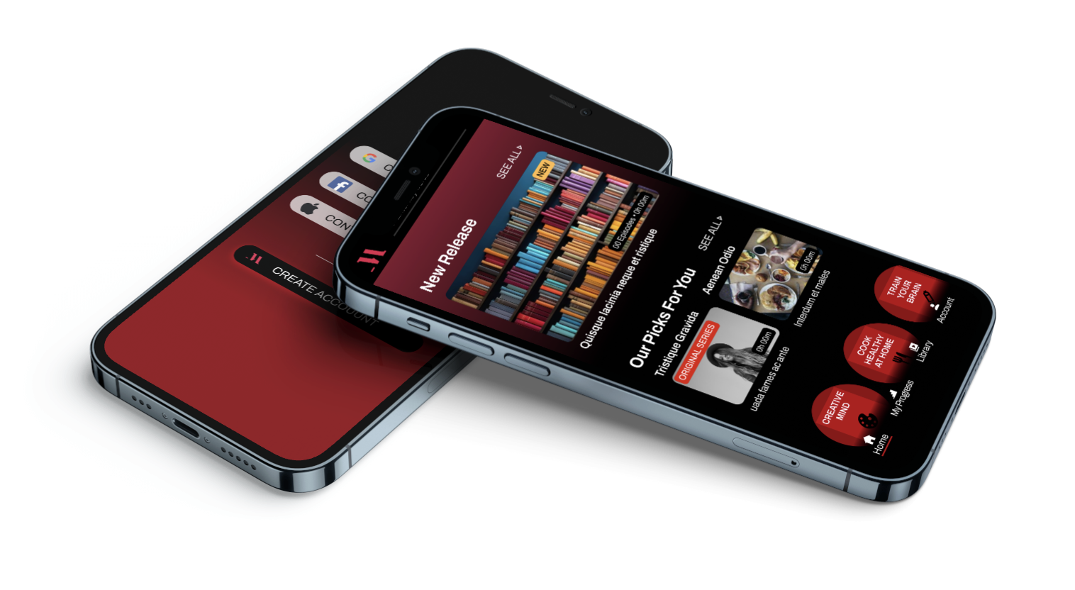
Results:
The redesigned MasterClass app incorporated several improvements based on identified issues and insights gathered throughout the design process:
Reduced carousel usage to minimize confusion.
Improved text hierarchy for enhanced readability and clarity.
Implementation of color-coded buttons for interactions, such as Gmail Login, Add to My List, and Sort By options, to improve visual cues and user guidance.
Streamlined sorting and filtering options to ensure consistency between different app sections.
Enhanced mobile optimization for seamless learning experiences across various devices.